Letter V, Blue
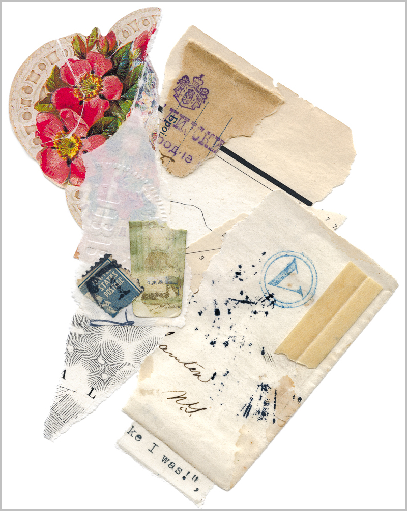
The pink flowers here were originally part of a label on a bar of soap. I liked the colors, and the rounded edge. After working on this piece for a few months, I have a new reason to avoid contemporary materials. The half-tone dots, intended to invoke Victorian era printing, aren’t real, and blur at scale. The sacrifice of sharpness in that small area suits this piece with its soft, dreamy neutral palette, so I’ve added it to my portfolio. This despite the fact that sharpness of detail is the bulk of the work in these prints. The blue “V” appeared on one of the first stampless covers I found. Also included are a bit of a Commodore Perry map, a cigar paper (so far, always my Dad’s), a US Postal Stamp, and more of the same Austrian money order I used in “Poppy with Orange and Blue.”

Your Air
Whoever kept this set of London Times (1833) had terrible handwriting. He or she occasionally made illegible notes and scratchy fountain pen checkmarks and x’s in the margins, and it is those notes in the upper right of this piece. The pink above it is a four pence stamp. I’m currently researching it, but my story until I discover otherwise is that it’s the equivalent of a price sticker. Also used here are a dust jacket, WWII era Yen, calligraphy, cellophane envelope window, botanical from 1950’s homemaking magazine and, again, the Austrian money order.

Poppy with Orange and Blue
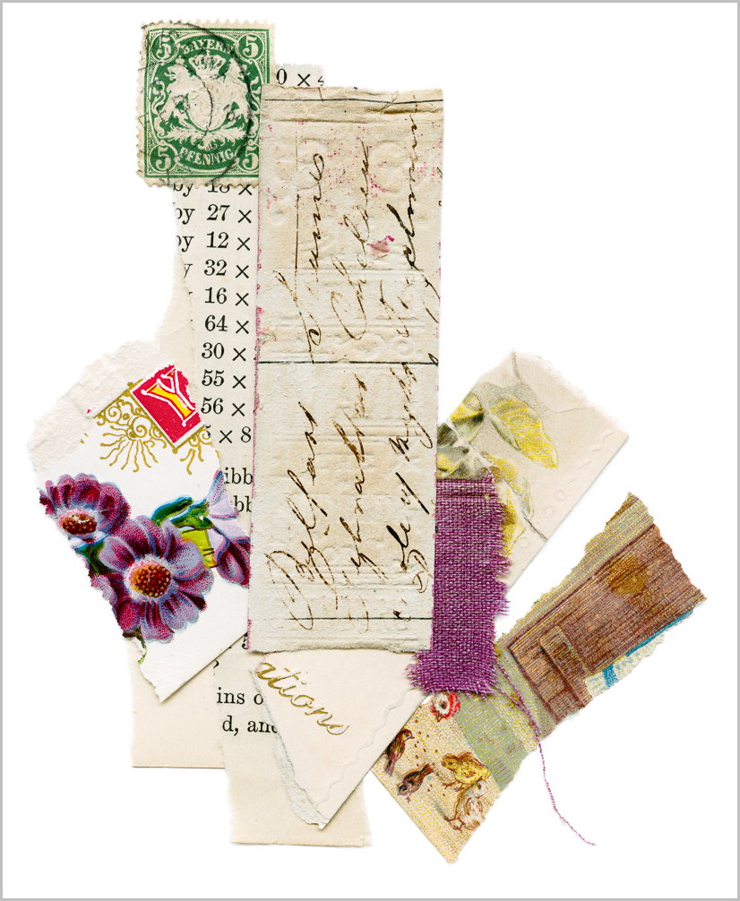
To achieve a faithful rendering of the orange binding in this piece took me almost two years. The swoop of threads and their shadows were another challenge. I’m happy with both and to add the bright colors and square composition to my portfolio. The fabric and blue paper are binding from a children’s book called Story Hour. A dust jacket I took from small book of poetry and a postcard contribute the other vivid color. The holes in the Austrian money order create interesting texture and lots of depth at scale. I’m fairly sure the typed bits are mine, but not 100%.
Spine with Handwriting
This column of paper was used to stiffen the spine of a book I dissembled. It picked up some of the cover’s embossing, which you can see here in reverse. And then, of course, there’s the intriguing handwriting. Except for the word Belfast, it’s illegible, and my current story is that it was scrap, but of course I don’t know. Also in this piece is a page from a math text, a scrap of book cloth, postcards, a Bulgarian stamp, and a Victorian advertisement for flour.

Your will can't save you
It can’t, can it? Collage made from postcards, a page from a partially completed stamp collector's album (“Popular Stamp Album,” 1896), and foxed ledger paper.

You said be
Created for the NCAR show, spring 2018, this big pink poppy came from a postcard. The piece also includes the brittle, broken corner of an early 20th Century cardboard studio portrait frame, a sheet of ledger paper, bit of rice paper, and advertisement.

Misery falls
The purple pansies were originally part of a postcard. Marbled paper is suminagashi marbled end paper. Also used here is an early 20th Century stock certificate, and miscellaneous text and papers.

No one has thought to love
I discovered this singed bit of local paper blow up against a fence one night when I was walking the dog. Here, too, are bits of an advertisement, and a section of the cross card (love) from a set of Lenormand Fortune Telling Cards (printed by Bernard Dondorf about 1911).

Like a ship that carried me
Flashcard, money order, poetry typed out on my Royal, and a waxed label.

Only with my doing can I grasp
Yellow tissue from a Victorian candy box, embossed edge of a postcard, paper cover from a 1950’s era guide to radio repair, handwriting, bits of advertisements.
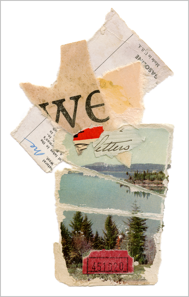
Because you were pretty and a boy
Summer's over. Perhaps not just summer, but that time of life when summer was so literally distinct from the rest of the year. In this piece, I've used both sides of a postcard, the reverse signed in the upper right with the curiously intimate "me"; the word "letters" is from Marion & Joe's correspondence, and has floated to the surface more than once before finding a place here. "We" appeared originally in a heavily foxed, oversized flash card. At scale, the halftone dots used in the trees are exquisite, as are the two strange reds: the brighter from a 50's era Marlboro advertisement and the other, of course, contributed by one of a spool of tickets I like to imagine was saved after a last summer trip to the shore.

Your body can't love you
Well, it can't, can it? And, yet, I spend an awful lot of time preoccupied by it. Perhaps that's what the circles are about? I don't know. If I did, I'd tear it up and begin again. Printed, this piece is deceptively delicate, a function of the color and the Japanese woodcut postage stamp. These stamps scale to reveal worlds. Other items used include: heavily distressed postcards, bits of a letter dated mid 19th century and embossed pansies from a turn of 20th century birthday card.

Love the things
Collage from bronze pigment printed on an Austrian tourist brochure echoing the shape of the orchid; book cloth, its trailing threads casting shadows, and more from the same 18th century letter that appears in "Your body can't love you," as well as an edge of the inked paper used in that piece.

The last of the garden
This collage is a bouquet invoking the tumult that is a garden in fall. Stamp and postcard, the sister raffle ticket to the one used in "Because you were pretty." The black strip is torn from another of Dad’s cigar loops, and the fabric square at the top left is from a label I found on a second hand blouse. Finally, more of the inked papers used in others of this series; this one including a small inked flower as well.

Dear darkening ground
Still reading Rilke's Book of Hours daily and this title, as many do, comes from a poem there. Piece is comprised of a bit from a math text, hand altered paper, an elaborate Victorian-era greeting card, and advertisement for flour. The charcoal grey piece in the background, a board from an old book, was so brittle it broke like a cracker rather than tear.

Commodore Perry interdicts the slave trade and opens Japan (with Dad's cigar loop)
Materials list in the title on this one! The handwriting and stamp come from an issue of The Times London, 1833. The reader took notes, intermittently, on what articles he or she had read. I've also used bits of postcard.

I am made of longing
Rilke, again. Postcard, and fabric from a book cover, as well as a WWII era money order.

You are not made by the crowd
When my father visited last year, he chose this piece for me to scan from dozens waiting. At the time, it was one of the most colorful pieces I'd ever made. A WWII era Japanese stamp is the center of this piece, surrounded by bits of postcard and fabric from the binding of a children's book.

I shall have no life
Title derived from a sonnet by Pietro Bembo for Lucrezia Borgia. Also used in this piece are a botanical from American Flora, bits of letter and stamp; an advertisement from a 1900's era tour guide to Philadelphia and the corner of a WWII era yen.

It speaks in the same voice
I'm not sure where this snippet of text derives from, but it's one that recites itself in my mind. Used in this piece is the spine of a ledger, bits of an old letter, and postcard, as well as a piece of the very sheer paper tipped in over an illustration in an old book. I typed on it with my Royal before I replaced the ribbon and in the 44" version of the print the uninked strike mark of a letter "m" is visible.

Fires of loss
Title derived from Mary Oliver's "Dogfish" (you must swim through the forest to stay / in this world) and "In Blackwater Woods" (the fires / and the black river of loss / whose other side // is salvation), which I typed on my circa 1925 Royal typewriter and tore up. Woodcut from an old book, and page from another book, flipped to highlight the relief impression—known as “the kiss”—of the type. Leaving a relief impression was not desirable in professional printing at the time (though we expect it in contemporary letterpress, view it as part of the charm), but I find the dimension and the resulting ghostly quality lovely.

This laboring of ours
Bit of a line from Rilke's "The Swan," of course. This is a postage stamp out of Australia, wedge of old letter, cello tape and envelope. This piece has the current distinction of being the tiniest original I've printed yet, at only about 1.5x2 inches.

Canada
Original assembled from a Japanese postage stamp, ink, sheet music, washi tape and handmade paper.

The Princess
Original assembled from a children's book illustration, postage stamp, handmade paper and washi tape.

Please Hold Still
Original assembled from a children's book illustration circa 1933, postcard, postage cancel, bee stamp, Washi tape and a mathematics text, 1927.

Wilderness
Original assembled from the cover from photographic souvenir guide to Orleans, France, c. 1900, a butterfly sticker, ink & letter "R" stamp, and a page torn from The Literary Digest 1927 Atlas of the World and Gazetteer, 1927.

XK
Original assembled from handmade Nepalese paper, washi tape, ink, mathematics textbook circa 1927 and commercially reproduced ledger page.

Toll
Original assembled from handmade Florentine and Nepalese papers, an Art Deco greeting card, washi tape and a postage stamp arranged on foxed endpaper.

Black Rising
Original assembled from moldered newspaper, handmade paper, contemporary postage cancel, architectural illustration.
New Prints: September 2018
Live Out Loud: Spring 2018
New Prints: November 2017
The Lives of the Poets II
The Lives of the Poets I
Indifferent Garden I